Redesigning GoDaddy’s Venture Forward online microbusinesses website
Project overview
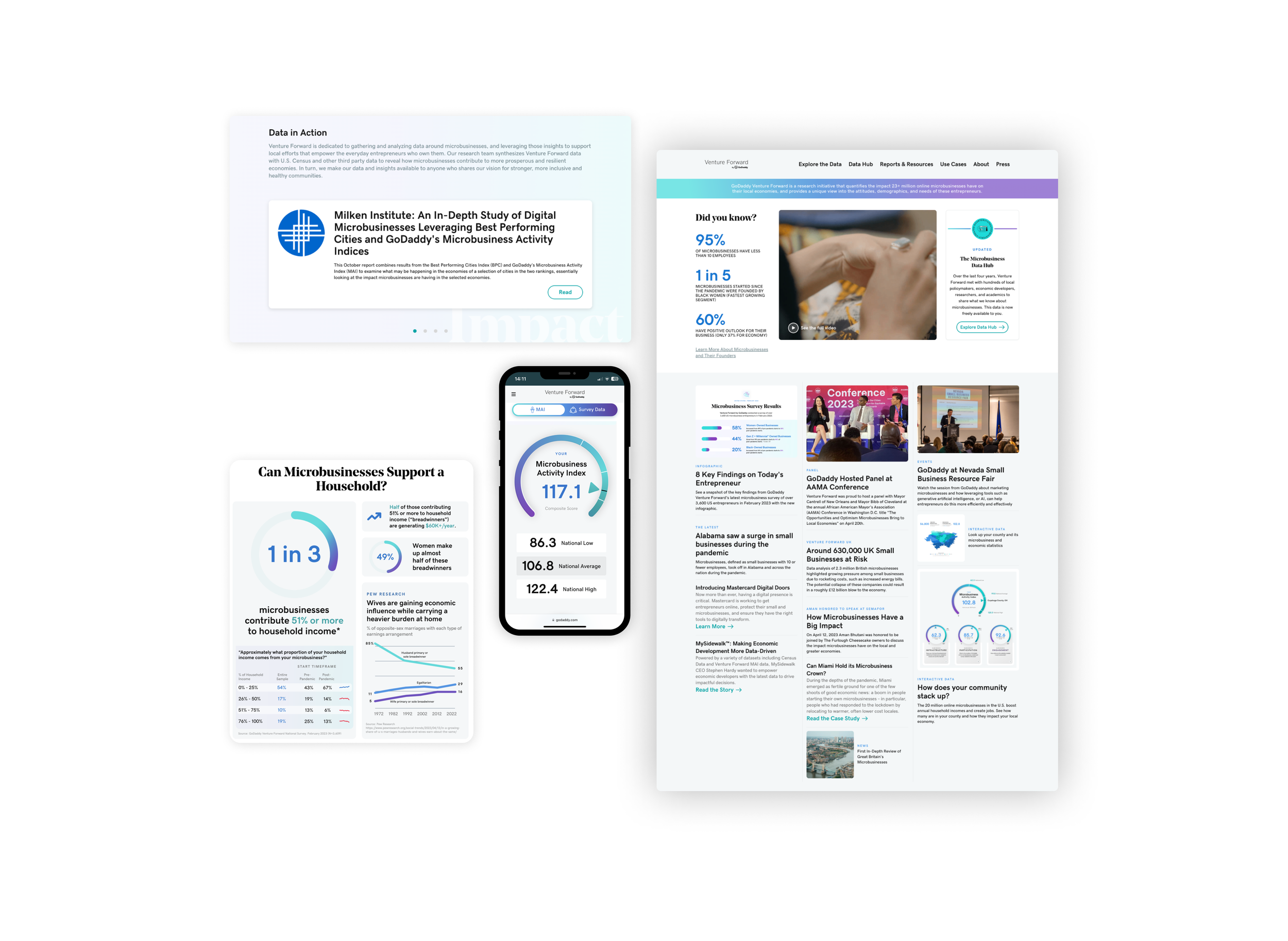
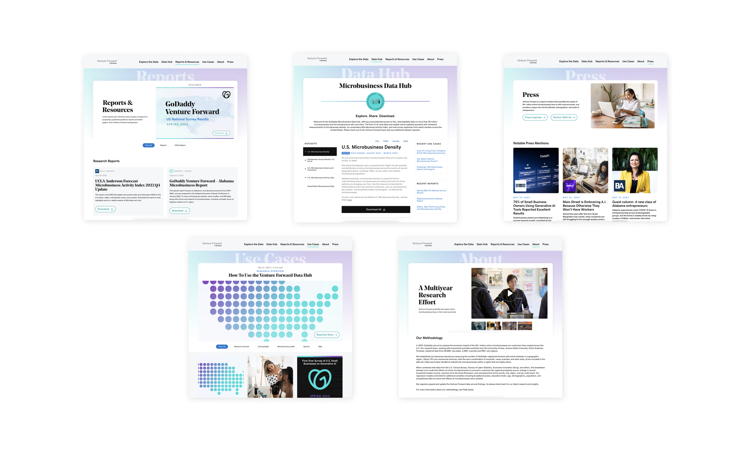
GoDaddy’s Venture Forward is a research initiative that focuses on the impact of online microbusinesses on local economies. Our team was tasked with revamping the entire website, giving it a modern touch with a new color palette, bold visual elements, and creating a consistent design system. Additionally, we were responsible for designing “Explore the data” page, allowing users to easily compare the national microbusiness activity Data by county with Venture Forward’s national survey results.
Client: GoDaddy’s Venture Forward is a research initiative that quantifies the impact 20+ million online microbusinesses have on their local economies, and provides a unique view into the attitudes, demographics, and needs of these entrepreneurs.
Goal: To redesign GoDaddy's Venture Forward online microbusinesses website. Aiming to provide a refreshing change to the website, incorporating a more modern style through the use of a new color palette, bolder visual elements, and a strong design system. We also needed to create an intuitive "explore the data" page that enables users to easily compare and analyze data. The overall objective was to enhance the user experience and effectively communicate the impact of online microbusinesses on local economies.
My role
UX/UI Designer
User Research, Design Documentation and Specifications, Design System & Prototyping
Graphic Designer
Producing Visual Assets: Infographics and Data-driven Reports
Project length
3 Months
Tools
Notion & Coda (Documentation)
Figma (Wireframes, Design System, Prototypes, Mockups)
Adobe Illustrator & Adobe Photoshop (Asset Creation)
Information gathering:
To kickstart the project, I was in charge of reviewing all the existing user journeys collecting screenshots. Additionally, the client supplied us with a comprehensive site audit, which provided valuable insights into the existing strengths and pain points. By carefully scrutinizing this information alongside tracking data that highlighted common drop-off points and frequently reported customer service issues, we were able to identify and prioritize key areas for improvement.

Understanding the problem: Existing product and issues
The existing Venture Forward microbusinesses website faced several issues that affected its user experience and effectiveness.
The website did not prioritize user experience, resulting in a unsatisfactory navigation flow with an extra difficulty in finding the desired information. Users, especially first-time visitors, encountered challenges in locating relevant data and understanding its significance.
The design of the website lacked consistency, which made it visually disjointed and confusing for users. Additionally, the website lacked proper accessibility and usability features, making it inaccessible for certain users and hindering their ability to access the information they needed.
Another issue was the amount of effort needed in finding and downloading microbusiness data. Users faced obstacles in locating and retrieving the desired data sets, limiting their ability to analyze and utilize the information effectively. This hindered their ability to derive meaningful insights and make informed decisions based on the collected data.
A notable issue was how the website struggled with effectively presenting the collected data in a manner that would resonate with its end users. The information was not showcased in a compelling and meaningful way, diminishing its impact and usefulness for the target audience.
Overall, the existing website lacked a user-centric approach, suffered from inconsistent design, posed challenges in accessing and understanding data, and failed to effectively present the collected microbusiness data.
Challenge #1
Easily locating relevant data and understanding its significance
One of the project's key challenges was to design the a page that effectively enables users to contrast and explore National microbusiness data (using a score that tracks and compares the health of microbusiness communities over time), along with the survey data collected from entrepreneurs. The objective was to create an interactive experience where users are eager to actively engage and effortlessly access comprehensive microbusiness information for any desired county. Our aim was to present the data in a user-friendly format that is easily digestible and provides valuable insights.
Challenge #2
Ensuring consistency and accessibility throughout
By creating a design system, we were able to create a unified visual language and design patterns that maintained a cohesive look and feel across the entire project. We standardized typography guidelines that helped maintain consistent font choices and sizes throughout the website. This ensured that text content was easily readable and accessible to all users.
Additionally, the design system included a comprehensive set of color guidelines, allowing us to create a more modern and bold color palette that not only aligned with the brand identity but also met accessibility standards.
Moreover, the design system offered a library of reusable components, such as buttons, forms, and navigation elements, which significantly expedited the design and development process. These components were designed with accessibility in mind, incorporating proper focus states, keyboard navigation support, and other accessibility best practices.
