Jobsnob: Recruiting service platform redesign
Project overview
During the span of two months, we undertook the task of redesigning Job Snob's website to ensure it harmonizes effectively with the company's latest product offerings. The primary objective of this project was to enhance the onboarding process for candidates and employers interested in applying or listing jobs. Additionally, we addressed the need for a visual overhaul of the homepage and purchase flow. Through meticulous design work, we successfully crafted a comprehensive onboarding experience that has been implemented and established within the platform.
Client: Job Snob is the first national job board and recruiting agency exclusively dedicated to Medical Aesthetics.
Goal: To revamp Job Snob's website aiming to create a seamless and visually appealing user experience that effectively guided users through the onboarding process and showcased the platform's features and benefits.
My role
UX/UI Designer
User Research, Visual design, Design System, Prototyping & Testing
Project length
2 Months
Tools
Notion & Coda (Documentation)
Figma (Wireframes, Design System, Prototypes, Mockups)
LucidChart (Information Architecture, Journey Map)
Adobe Illustrator & Adobe Photoshop (Asset Creation)
Understanding the problem
Our main focus was to elevate the onboarding process for candidates and employers looking to apply or list jobs. Alongside that, there was a crucial need for a visual revamp of the homepage and job listing purchase flow.
Our team's overarching goal was to enhance the front and back-end user experience for all platform users, including internal users (like recruiters and admins) and end consumers whilst also taking into account the site creation process to improve efficiency and align with the platform's business objectives.
How might we optimize the platform to increase engagement and conversion?
How might we showcase the unique value proposition of Jobsnob to attract both candidates and employers?
How might we enhance the search functionality to make it easier for candidates to find relevant job listings?

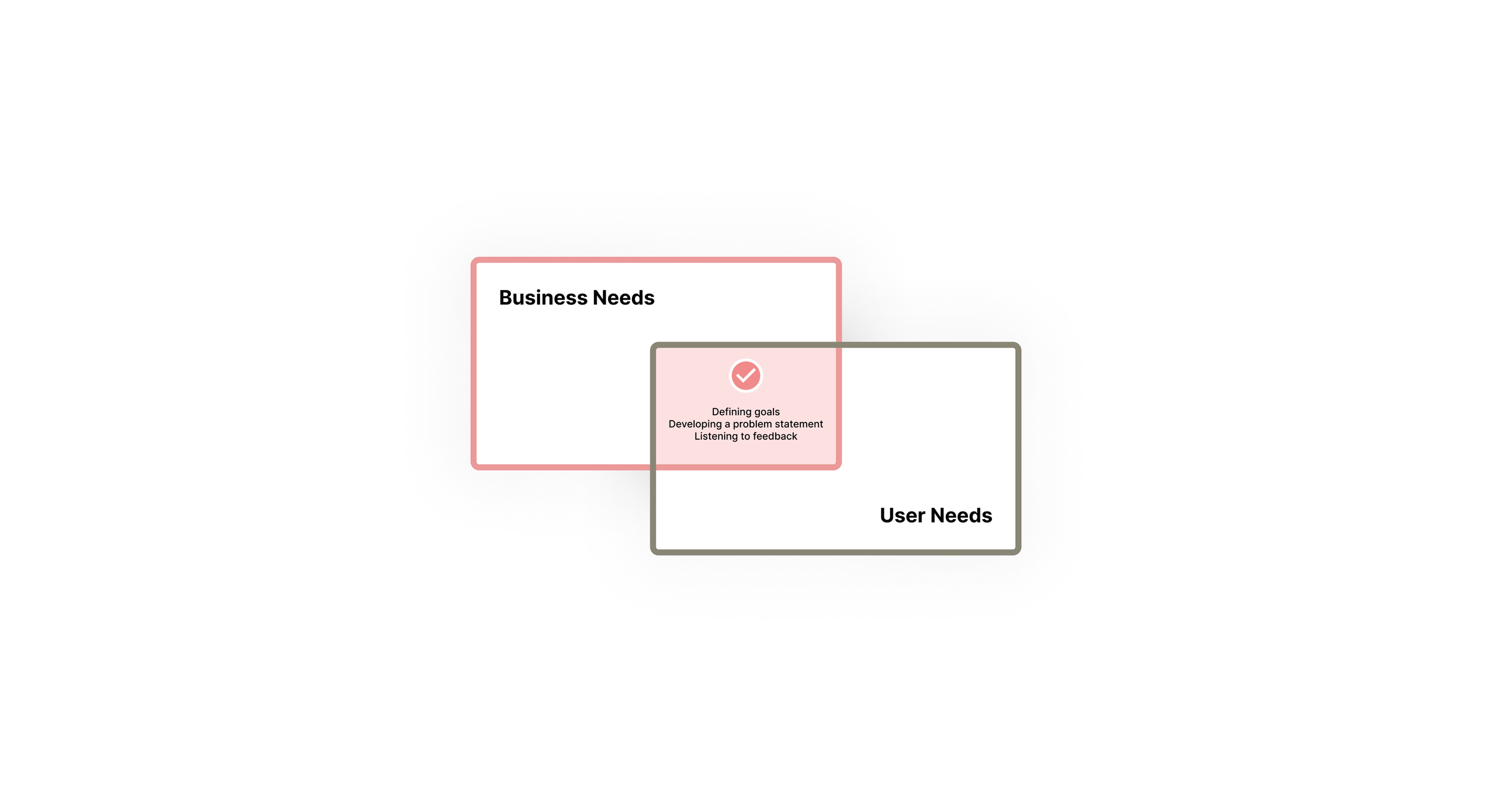
Business needs
Jobsnob had several key business needs that drove the project's objectives:
Increase user acquisition: attracting a larger user base of both candidates and employers to the Jobsnob platform, ultimately driving growth and expanding the user network.
Improve conversion rates: aiming to optimize the onboarding process and user journey to increase the conversion rate of visitors into registered users or paid subscribers, ultimately driving revenue and monetization.
Differentiate from competitors: establishing unique features and functionalities that set Jobsnob apart from other job listing platforms.
Streamline operations: enhancing the efficiency of internal processes and workflows related to managing job listings, candidate applications, employer accounts, and other administrative tasks.
Ensure scalability and reliability: aiming to build a robust and scalable platform that can handle increased user traffic, data storage, and system performance as the user base grows.
Gather and analyze data: Jobsnob wanted to focus on capturing relevant data and insights from user interactions on the platform.
“Timing is KEY. We don’t want it to take a week to change a word on the site”
- Stakeholder
“The instructions on the onboarding process were unclear and I had to keep going back and forth to complete my profile”
- User
“It’s so hard to narrow down my job search, most of the jobs presented to me don’t match my criteria”
- User
User needs
During the initial phase of exploration, we engaged with a diverse group of stakeholders including managers, recruiters, designers and developers to gather valuable feedback and identify pain points. This collaborative approach allowed us to formulate a well-defined strategy for effectively addressing these challenges. Additionally, we leveraged a large amount of data accumulated from extensive testing conducted over a year, focusing on end users within the target demographics. This data, combined with insights from feature requests, bug reports and competitor analysis, provided us with valuable opportunities for improvement.
Given the diverse goals, needs, and restrictions of each user type on the platform, it became crucial to prioritize the definition of different user groups. We categorized them into four distinct groups:
admins: responsible for platform management and functionality oversight
recruiters: Jobsnob team members tasked with matching candidates to suitable jobs and vice versa
employers: users that have to create accounts and purchase credits to list job openings
candidates: users who have to create accounts in order to apply to available jobs
Throughout this discovery process, it was emphasized the importance of a seamless onboarding experience for both employers and candidates, as well as a homepage that efficiently guided users towards their intended goals and having a robust search and filter functionality that helped users narrow down their job search based on their specific criteria.
It became evident that our primary focus should be on establishing a robust information architecture for the site and developing a strong design system. This approach would enable us to create a sufficient range of component variants tailored to different user types, while ensuring a cohesive and consistent design across the platform.

Building a solution: Customer journey map + Information architecture
In the initial stages of the design process, I personally prioritize creating a product-based journey map that help gain deeper insights into the experiences of different user types on the platform, including candidates, employers, recruiters, and admins. These experience maps enabled us to better understand the unique needs and interactions of each user group. The original flow was greatly adapted as we wanted to get rid of any unnecessary complications. Our goal was to make the platform easier to use and more intuitive for everyone involved.
Subsequently, we proceeded to map out the main pages and creating a solid information architecture. Our main goal was to establish a smooth onboarding experience for both candidates and employers as well as eliminating any dead ends, minimizing pain points and ensuring that users can easily navigate through the platform with minimal clicks, efficiently reaching their desired destinations.
Component redesign:
Based on these findings, we created a list of priority components (the header and footer, for example) which all sites would need. We then addressed specific requests for each user type, tailoring the components to suit their specific needs. As a team, we meticulously defined and customized each component to align with the target demographic.
The components were specifically tailored for a recruiting platform. For instance, we incorporated a card module for effectively presenting job listings. The onboarding pages for both candidates and employers were designed using the same components, with a focus on accessibility. We implemented a module with guided steps to ensure users are aware of their progress throughout the onboarding process. Additionally, we added a favorite/bookmark button, enabling users to save their preferred job listings in their account.

From dull to dazzling: Avoiding uninspiring grey boxes for better client engagement
Using wireframes for user testing and presenting journeys to clients had not been especially successful in the past. Clients found it difficult to visualize how these grey boxes would magically transform into their beautifully branded site. During meetings, stakeholders often complained that low-fidelity prototypes didn’t match up to their expectations of a medical aesthetic recruiting site.
To overcome this hurdle, we decided to adopt a different approach by creating "polished" wireframes. These wireframes incorporated the brand's color palette and typography, allowing us to showcase the components in a more refined manner. This approach not only presented the components in the best possible light but also provided stakeholders with clear guidance on the necessary assets to achieve the desired quality and ensure a seamless user experience.

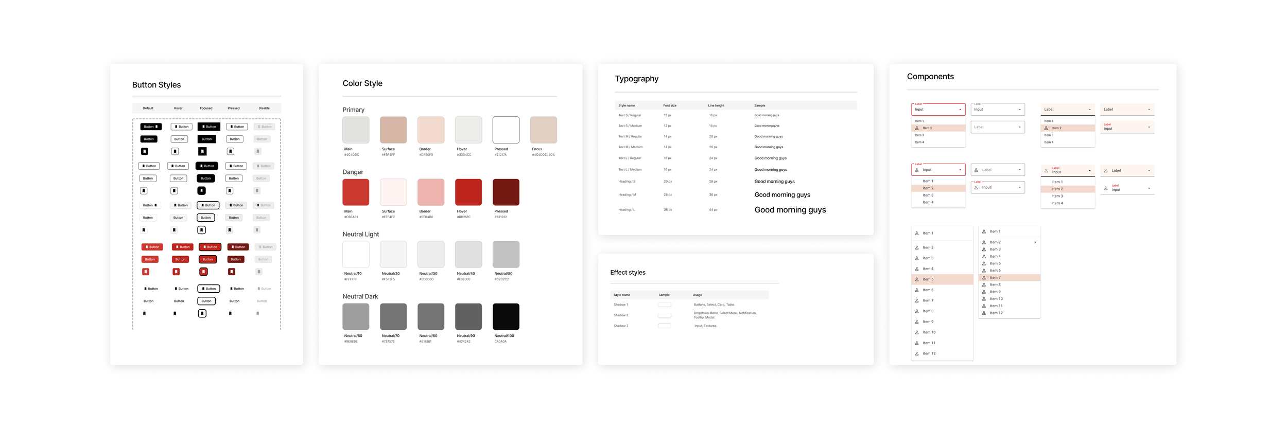
Design system: From atoms to pages
Each component was designed upwards from small building blocks, based on Atomic Design principles. When working on a new site, we are usually provided with a digital library of full components, smaller elements and usage guidelines, all included in the accompanying design system. It's like having a toolkit that lets designers mix and match existing functionality while identifying any brand-specific requests that might need extra development work. This speeds up the design process, prototyping, and development while ensuring everything stays consistent. But for this project, we had to build everything from scratch.
To maintain consistency and flexibility, we embraced Atomic design approach. We started by creating and organizing elements into Atoms, Molecules, Organisms, Templates, and Pages. It was a clever way to think about the project as a puzzle made up of smaller building blocks. We had typography, colors, and grids under 'styles,' while atoms, molecules, and smaller organisms were placed under 'elements.' The bigger stuff went into the 'components' category. Cards had their special section, just like all the elements related to the onboarding pages. Stakeholders loved this terminology update, and although we intended to further refine it with the engineering team's input, time constraints led us to revert to our original categorization.

Guidelines and Documentation: Communicating design
Creating comprehensive and clear documentation is crucial for defining and communicating visual design, user experience, engineering values, and maintaining a consistent design and development process. This enables seamless adoption of the platform by internal and external teams, fostering collaboration and alignment.
As the person responsible for writing visual design specifications, my primary focus was on achieving consistency and clarity throughout the documentation. By collaborating on the product design requirement document, I ensured that it encompassed all the necessary information for the successful delivery of our product by the development team. This document served as a guide, emphasizing the importance of fixed elements, potential risks when modifying certain aspects, and outlining expected interaction details to maintain a clear user flow aligned with user goals.
Additionally, I tailored all the documentation to cater to stakeholders, developers, and content editors, providing concise and relevant guidelines specific to their roles, ensuring easy access to the information they needed.
Outcome: Save time, improve quality
Job snob’s project demonstrates the significant impact of implementing a well-built design system based on an atomic design approach. By breaking down the design elements into atoms, molecules, organisms, templates, and pages, we were able to create a robust and flexible system that greatly influenced the efficiency and effectiveness of the project.
One notable outcome was the remarkable decrease in the time required to build all the pages. With the design system in place, we had a curated collection of pre-designed components that could be easily reused and assembled, resulting in a streamlined development process. This not only saved valuable time but also maintained consistency across the platform.
Moreover, the design system really helped us ensure the responsiveness of our designs. The modular nature of the atomic design approach allowed us to adapt and rearrange the components effortlessly, making sure we had an optimal user experiences across different devices and screen sizes. This flexibility greatly enhanced the platform's accessibility and usability.
Additionally, the design system facilitated iterative design processes. With a comprehensive library of elements and guidelines, we could iterate and refine the designs swiftly, incorporating user feedback and making necessary improvements.
Learnings:
Big challenges require small steps. In the face of significant challenges, I had to remember that progress comes from taking small steps. Instantaneous changes are unrealistic, instead focusing on asking the right questions and breaking down complex tasks into manageable actions will steadily move you towards meaningful and impactful change.
Journey mapping has become my trusted ally, particularly in intricate projects. It serves two crucial purposes: firstly, to document a comprehensive process and uncover both challenges and opportunities, and secondly, to establish a solid foundation for seamless collaboration among stakeholders. Journey mapping is an invaluable tool that ensures clarity and fosters effective cooperation.
Making better products, faster. Design systems do sound scary but they hold the ultimate key to unlocking consistency and efficiency in the design process. Embracing a design system has completely transformed my approach to tackling design problems. It benefits not only myself as a designer but also developers, stakeholders, and users alike.

